 |
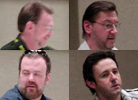
| (Clockwise from top left: Michael Golden, Joe Jusko, J. Scott Campbell & Dave Johnson. Not pictured: Frank Cho, Amanda Conner & Tim Sale.) |
The panelists began with a discussion of doing covers versus doing interior comic book art. Scott Campbell has found that, while he exclusively does covers now, he does miss creating interior art, but returning to drawing stories would mean a pay cut..
Amanda loves doing covers. It's good exposure and pays better, but she loves doing interior art more. She loves making the story happen on the page.
Joe Jusko prefers doing covers, but Tim Sale prefers interiors, designing the story on the page.
Michael Golden doesn't find a difference between the two, other than the time factor. While the process may be different for both, they require the same skills and the same priorities. He finds that drawing covers does offer a greater range of artistic freedom and layout design.
Frank joked that he has a short attention span. When he is drawing covers he prefers interiors, and when he works on story art, he prefers covers. The grass always seems greener on the other side.
The panel was asked on the pleasures of collaborating. Michael said that a collaboration is both rewarding and pure hell. Everyone comes to the table with a vision. An editor's job is to accommodate those visions while making sure they suit the project.
Joe said that when he switched to painting, he found he was not fast enough to do a book. Also, when he looked at artists work when inked by others, he didn't want to risk his own work being destroyed by someone else. He also mentioned that he is a fan of narrative covers. Otherwise a comic book cover is only a poster. Joe feels that the cover should tell something about the cover.
Scott mentioned that on occasion he has done covers for new series, which has been a challenge when he wasn't involved with designing any of the characters, or familiar with the story.
Amanda felt that the cover should show something from inside the book. She said it's also important for a colorist to work with the cover penciller.
Tim said that since he is color blind, his covers are high contrast like his interiors, so he inks his own work.
Michael admitted that he never liked collaboration, not because of ego, but because of a lack of consistency in the production process. Now, with the abilities of computer graphics, he is able to do all of the work himself so that he can ensure that what's on the computer screen will appear on the printed page.
Tim added that editors used to discourage collaboration among the creative staff. Now it's common. Amanda also mentioned that collaboration works better when the creative team communicates well together.
Scott said he was always nervous when he worked with someone new, because he didn't know if he could trust that person.
Frank said that he works with the same colorist. Because his own pencils are so loose, he inks his own work. He hates collaboration because there is a lot of miscommunication. The end product feels compromised, and he isn't satisfied with it.
Another question was about the panelists' influences both in and out of comics, and the best criticism they received. Scott said that when he first began doing covers, he enjoyed not having to be so narrative. He liked the ability to be more abstract. He likes his covers to look like a movie poster. Marvel mandated that covers be without clutter. Scott said that some comic book artists feel that they have to fill a cover, but sometimes the elements on the cover cancel each other out and compete for attention. He has found that the simple approach works best.
Dave Johnson said that he was a big Michael Golden fan. He also learned a lot from graphic designers and novel covers, and brought that into his comic book work. Dave prefers a minimalist approach. He said that a motorist has 2.5 seconds to understand a billboard, and that looking at a comic book cover should be as simple. Alex Toth's critique of Steve Rude showed that Dave was doing some things right.
Amanda didn't have many influences. When she first began to do covers, she tried to cram as much information as she could into the image. After going into many comic book stores, she was attracted to the stark, simple covers. Now she is influenced by movie posters from the 1960's and 1970's. She tries to mesh communicating a lot of information in a good design. Amanda likes the storytelling aspect of a cover and tries to make it graphically stimulating.
Tim Sale looked at other media, such as paperback covers that were clear and powerful. There was no reason that couldn't translate to comic books. He feels that anything can tell a story, such as portraits. What does the pose say about the person.
Frank's biggest influences were the golden age of illustration, such as Norman Rockwell. His jog as a cover artist is to sell books. He mentioned that Julius Schwartz once said that a cover with a gorilla on a bike, a volcano in the background and the color purple is a winner.
Amanda said that they should all draw that cover.
Next Episode: MegaCon 2011 Spotlight On Amanda Conner Panel!
Join the Superman Fan Podcast and My Pull List groups or pages on facebook, and follow the podcast and blogs on twitter @supermanpodcast.
Superman Fan Podcast is a proud member of the League Of Comic Book Podcasters at http://www.comicbooknoise.com/league and the Comics Podcast Network! http://www.comicspodcasts.com/, and is now a proud member of the Superman WebRing of websites, and the Superman Podcast Network at http://www.fortressofbaileytude.com/supermanpodcastnetwork. Check it out to discover other fine Superman podcasts.
Superman Fan Podcast is at http://supermanfanpodcast.mypodcast.com/ . Send e-mail about this podcast to supermanfanpodcast@gmail.com.
The theme of this podcast is Plans In Motion, composed by Kevin MacLeod, and part of the royalty free music library at http://incompetech.com.
My Pull List is my spoiler free comic book review blog of the titles I read every week. It can be found at http://mypulllist.blogspot.com/. Send e-mail about this blog to mypulllist@gmail.com.
Superman and all related characters are trademark and copyright DC Comics. Any cover art displayed with the show notes is done for entertainment and educational purposes only. I post these episodes to share my enjoyment of Superman comics and do not earn any money from this podcast.
Thanks for listening to the Superman Fan Podcast and, as always, thanks to Jerry Siegel and Joe Shuster.


No comments:
Post a Comment